Smart Homepage Experience
- May 12, 2024
- 5 min read
Updated: Jun 5, 2024
AI-infused, personalized Oracle Cloud Applications home experience

Oracle, 2016-17
Role: Design Lead
Background
Back in 2016, Oracle Cloud Applications had recently been re-launched with a completely overhauled design (then called Simplified UI) that was more accessible to tablet and touchscreen users, which made up a growing segment of the user base. The home page consisted of a simple springboard of icons with access to the user applications, and eventually, a summary panel was added with some high-level information and launch points.

In user testing and customer conversations, we learned that our one-size-fits-all approach to the home page didn't serve the needs of anybody particularly well because there were so many different roles and personas accessing the various applications (of which there were nearly a hundred in total).
Users asked for customization options, but looking at usage data of our existing solutions that did allow for fine-grained customization, it became clear that while many users want a personalized experience, they don't actually want to customize it themselves.
My goal was to find a way to give users a smarter home experience, where with the help of ML/AI and role-specific use cases the experience adapts to the needs of the user.
Objective
Create a UI framework for the Oracle Cloud Apps home page to facilitate AI-driven personalization. Design a modular system that can be implemented with current technology while allowing it to grow.
Process
With this project being explorative and forward-looking, few resources outside our immediate group were committed yet. I left Oracle before the implementation phase started.
Discovery & Definition
The key challenge was to present a design that can be implemented with current technology while allowing it to grow when technical hurdles are overcome. The design needed to be modular so that developers could implement parts of it right away while leaving more difficult problems for later without having to go through another significant redesign. What we needed was a solid adaptive framework on which to build.
Another major challenge was getting all the requirements from the various product teams across all of Oracle Cloud apps and understanding how each user role would benefit the most from a smart home page experience. That required knowledge of domain-specific context to know which information is most valuable to a user in which context. For that, I reached out to Product Managers and developed an initial shortlist of candidates for user stories.
After studying the research on AI-assisted systems and setting up a focus group to brainstorm with users and stakeholders, it became clear that the tricky part was going to be balancing user needs with their comfort level and need for control. There is a trade-off between more controlled personalization and anticipated content and potentially creepy or inaccurate suggestions that could disrupt or confuse the user.

There are three levels of AI assistance: autonomous execution of tasks, concrete recommendations for the user, and merely presenting the user with contextual data so they draw their own conclusions about the course of action. The appropriate level not only depends on the task and severity of consequences but greatly on the level of trust the user has in the system. So, we needed a framework that would work with different levels of autonomy while allowing the user to change that over time, for instance, by delegating tasks to an automated system or taking back control when needed.
There are over a hundred Oracle apps that were either already part of the SaaS cloud or would move to it, each with different relevant content. It's not feasible to centralize that effort in the hands of a single team, so the system needs to be open for product teams to contribute their content. As such, I needed to balance openness and control to ensure flexibility and a consistent user experience. Finally, while the framework was focused on the home page experience, it needed to be modular enough that parts could be re-used inside an application.
I developed an initial proposal that I validated with stakeholders and refined it a few more times before I presented it to product leadership.
Impact
After I shared my proposal with product leadership, another group was formed to explore a path to product. Additional designers were assigned to work out the interaction details of the widgets and refine the visual design. I continued to work closely with the team responsible for the backend and oversaw the design work until I departed Oracle.
Output

The proposed design solution included
A widget-based system where contextual information could be pushed to the user
A grid-based, multi-page framework to place the widgets
A re-design of current home page UI elements in Oracle as widgets
A UI spec for widgets so that in addition to the widgets I designed, product teams can design their own
Strategies to adapt the grid content to an AI-driven backend
I distinguished between three different content types: static content, which never changes and is predictable, dynamic content, which is suggested by the AI system, and personalized content, which the user adds to their experience manually. The other distinction was between the level of interactivity or immediacy: from purely navigational controls, such as icons, to highly transactional ones, such as forms and actions embedded right on the page. The framework allows for all of these to co-exist within the home page.
One of the difficulties in providing an optimized entry experience for a user is that requirements keep changing, user roles are added or removed, or they change over time, and products are added and dropped. I wanted to avoid re-designing the home experience every time one of the fundamental assumptions changes. We achieve this by building a modular framework that allows us to add or remove components over time without breaking the UI.
Highlights
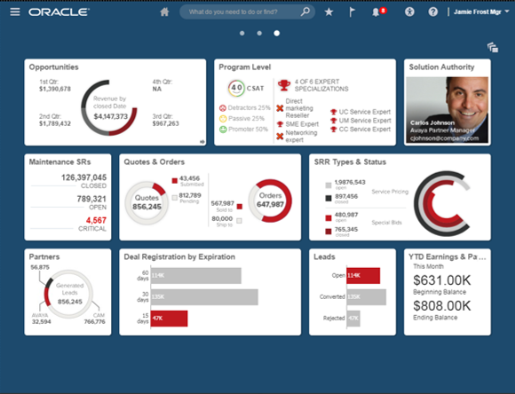
Widgets

Widgets come in various sizes and share a common set of controls and interaction rules, but they can also have interactions specific to the widget. Product teams can create custom widgets by following the design specs. Widgets can be placed in several ways: as part of the out-of-the-box setup, by an admin for all users, by the end-user, or dynamically by the system. Some widgets are static, so while their information may change, the user wants the widget to stay in place. Others appear dynamically in a specific context or rules determined by the AI backend.
Widgets can be role-specific or universal. They center around events relevant to the user and the actions they can take on them. They are context-aware in that some only apply to specific contexts (device type, time, location, milestones, and other factors). They can come in different sizes depending on the context or through direct manipulation by the user (i.e., resizing the widget or toggling a view).
I re-created all current UI elements on the home page as widgets so that the system can be implemented gradually. With the input from domain experts, I also designed a few product-specific widget examples so that product teams can get a sense of the value-add.

Universal Grid

The universal grid spans multiple pages on the home experience and accommodates both static and dynamic widgets of various sizes. The grid expands to make room for new dynamically added widgets. While the content updates continuously, dynamic widgets appear between home page visits. Urgent, immediate information is pushed to the user through different channels available throughout the application.